Ready to move beyond static mockups? Here is a practical, step-by-step guide to Intent Prototyping — a disciplined method that uses AI to turn your design intent (UI sketches, conceptual models, and user flows) directly into a live prototype, making it your primary canvas for ideation.
In Part 1 of this series, we explored the “lopsided horse” problem born from mockup-centric design and demonstrated how the seductive promise of vibe coding often leads to structural flaws. The main question remains:
How might we close the gap between our design intent and a live prototype, so that we can iterate on real functionality from day one, without getting caught in the ambiguity trap?
In other words, we need a way to build prototypes that are both fast to create and founded on a clear, unambiguous blueprint.
The answer is a more disciplined process I call Intent Prototyping (kudos to Marco Kotrotsos, who coined Intent-Oriented Programming). This method embraces the power of AI-assisted coding but rejects ambiguity, putting the designer’s explicit intent at the very center of the process. It receives a holistic expression of intent (sketches for screen layouts, conceptual model description, boxes-and-arrows for user flows) and uses it to generate a live, testable prototype.
This method solves the concerns we’ve discussed in Part 1 in the best way possible:
Unlike static mockups, the prototype is fully interactive and can be easily populated with a large amount of realistic data. This lets us test the system’s underlying logic as well as its surface.
Unlike a vibe-coded prototype, it is built from a stable, unambiguous specification. This prevents the conceptual model failures and design debt that happen when things are unclear. The engineering team doesn’t need to reverse-engineer a black box or become “code archaeologists” to guess at the designer’s vision, as they receive not only a live prototype but also a clearly documented design intent behind it.
This combination makes the method especially suited for designing complex enterprise applications. It allows us to test the system’s most critical point of failure, its underlying structure, at a speed and flexibility that was previously impossible. Furthermore, the process is built for iteration. You can explore as many directions as you want simply by changing the intent and evolving the design based on what you learn from user testing.
My Workflow
To illustrate this process in action, let’s walk through a case study. It’s the very same example I’ve used to illustrate the vibe coding trap: a simple tool to track tests to validate product ideas. You can find the complete project, including all the source code and documentation files discussed below, in this GitHub repository.
Step 1: Expressing An Intent
Imagine we’ve already done proper research, and having mused on the defined problem, I begin to form a vague idea of what the solution might look like. I need to capture this idea immediately, so I quickly sketch it out:
A low-fidelity sketch of the initial idea. (Large preview)
In this example, I used Excalidraw, but the tool doesn’t really matter. Note that we deliberately keep it rough, as visual details are not something we need to focus on at this stage. And we are not going to be stuck here: we want to make a leap from this initial sketch directly to a live prototype that we can put in front of potential users. Polishing those sketches would not bring us any closer to achieving our goal.
What we need to move forward is to add to those sketches just enough details so that they may serve as a sufficient input for a junior frontend developer (or, in our case, an AI assistant). This requires explaining the following:
Navigational paths (clicking here takes you to).
Interaction details that can’t be shown in a static picture (e.g., non-scrollable areas, adaptive layout, drag-and-drop behavior).
What parts might make sense to build as reusable components.
Which components from the design system (I’m using Ant Design Library) should be used.
Any other comments that help understand how this thing should work (while sketches illustrate how it should look).
Having added all those details, we end up with such an annotated sketch:
As you see, this sketch covers both the Visualization and Flow aspects. You may ask, what about the Conceptual Model? Without that part, the expression of our intent will not be complete. One way would be to add it somewhere in the margins of the sketch (for example, as a UML Class Diagram), and I would do so in the case of a more complex application, where the model cannot be simply derived from the UI. But in our case, we can save effort and ask an LLM to generate a comprehensive description of the conceptual model based on the sketch.
For tasks of this sort, the LLM of my choice is Gemini 2.5 Pro. What is important is that this is a multimodal model that can accept not only text but also images as input (GPT-5 and Claude-4 also fit that criteria). I use Google AI Studio, as it gives me enough control and visibility into what’s happening:
Generating a conceptual model from the sketch using Google AI Studio. (Large preview)
Note: All the prompts that I use here and below can be found in the Appendices. The prompts are not custom-tailored to any particular project; they are supposed to be reused as they are.
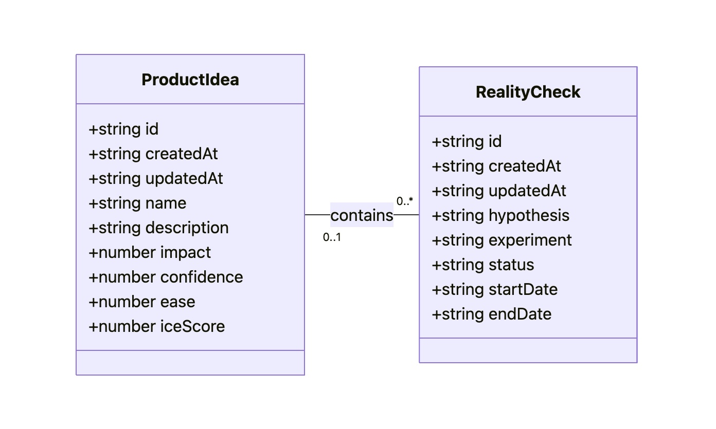
As a result, Gemini gives us a description and the following diagram:
The diagram might look technical, but I believe that a clear understanding of all objects, their attributes, and relationships between them is key to good design. That’s why I consider the Conceptual Model to be an essential part of expressing intent, along with the Flow and Visualization.
As a result of this step, our intent is fully expressed in two files: Sketch.png and Model.md. This will be our durable source of truth.
Step 2: Preparing A Spec And A Plan
The purpose of this step is to create a comprehensive technical specification and a step-by-step plan. Most of the work here is done by AI; you just need to keep an eye on it.
I separate the Data Access Layer and the UI layer, and create specifications for them using two different prompts (see Appendices 2 and 3). The output of the first prompt (the Data Access Layer spec) serves as an input for the second one. Note that, as an additional input, we give the guidelines tailored for prototyping needs (see Appendices 8, 9, and 10). They are not specific to this project. The technical approach encoded in those guidelines is out of the scope of this article.
As a result, Gemini provides us with content for DAL.md and UI.md. Although in most cases this result is quite reliable enough, you might want to scrutinize the output. You don’t need to be a real programmer to make sense of it, but some level of programming literacy would be really helpful. However, even if you don’t have such skills, don’t get discouraged. The good news is that if you don’t understand something, you always know who to ask. Do it in Google AI Studio before refreshing the context window. If you believe you’ve spotted a problem, let Gemini know, and it will either fix it or explain why the suggested approach is actually better.
It’s important to remember that by their nature, LLMs are not deterministic and, to put it simply, can be forgetful about small details, especially when it comes to details in sketches. Fortunately, you don’t have to be an expert to notice that the “Delete” button, which is in the upper right corner of the sketch, is not mentioned in the spec.
Don’t get me wrong: Gemini does a stellar job most of the time, but there are still times when it slips up. Just let it know about the problems you’ve spotted, and everything will be fixed.
Once we have Sketch.png, Model.md, DAL.md, UI.md, and we have reviewed the specs, we can grab a coffee. We deserve it: our technical design documentation is complete. It will serve as a stable foundation for building the actual thing, without deviating from our original intent, and ensuring that all components fit together perfectly, and all layers are stacked correctly.
One last thing we can do before moving on to the next steps is to prepare a step-by-step plan. We split that plan into two parts: one for the Data Access Layer and another for the UI. You can find prompts I use to create such a plan in Appendices 4 and 5.
Step 3: Executing The Plan
To start building the actual thing, we need to switch to another category of AI tools. Up until this point, we have relied on Generative AI. It excels at creating new content (in our case, specifications and plans) based on a single prompt. I’m using Google Gemini 2.5 in Google AI Studio, but other similar tools may also fit such one-off tasks: ChatGPT, Claude, Grok, and DeepSeek.
However, at this step, this wouldn’t be enough. Building a prototype based on specs and according to a plan requires an AI that can read context from multiple files, execute a sequence of tasks, and maintain coherence. A simple generative AI can’t do this. It would be like asking a person to build a house by only ever showing them a single brick. What we need is an agentic AI that can be given the full house blueprint and a project plan, and then get to work building the foundation, framing the walls, and adding the roof in the correct sequence.
My coding agent of choice is Google Gemini CLI, simply because Gemini 2.5 Pro serves me well, and I don’t think we need any middleman like Cursor or Windsurf (which would use Claude, Gemini, or GPT under the hood anyway). If I used Claude, my choice would be Claude Code, but since I’m sticking with Gemini, Gemini CLI it is. But if you prefer Cursor or Windsurf, I believe you can apply the same process with your favourite tool.
Before tasking the agent, we need to create a basic template for our React application. I won’t go into this here. You can find plenty of tutorials on how to scaffold an empty React project using Vite.
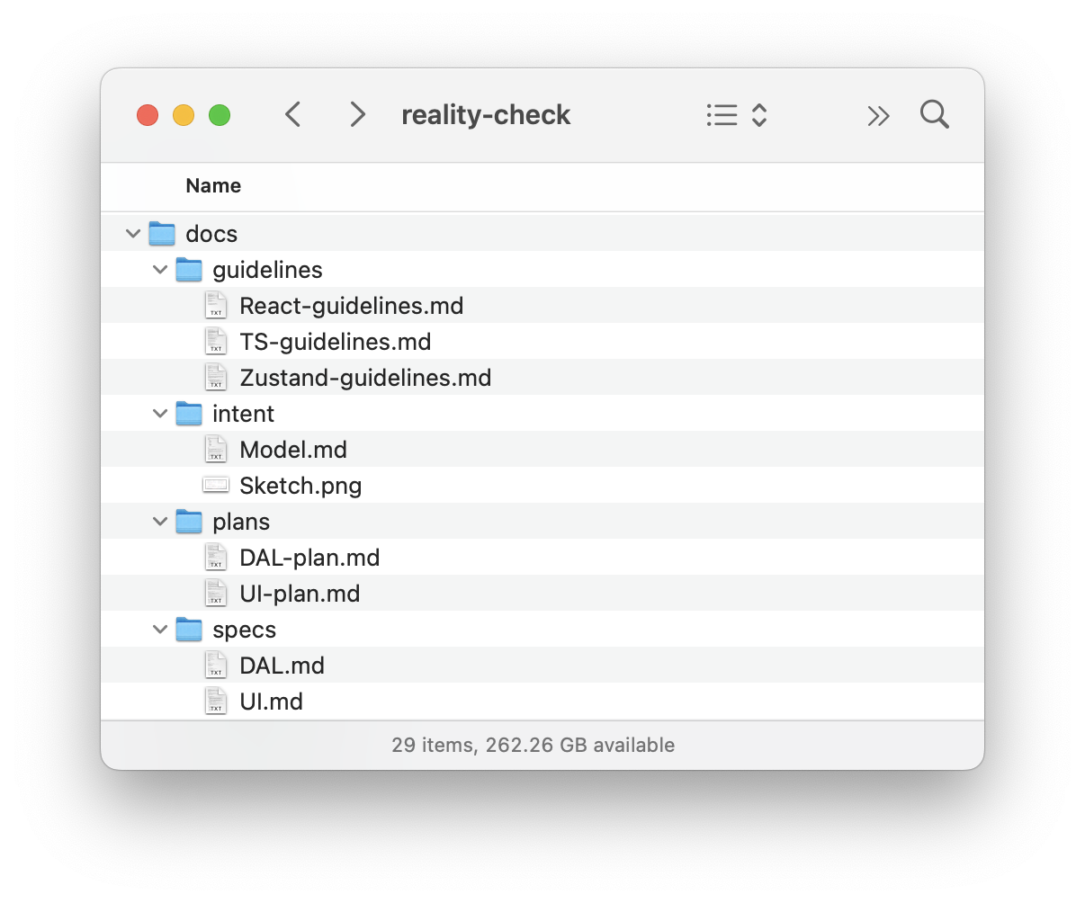
Then we put all our files into that project:
Project structure with design intent and spec files. (Large preview)
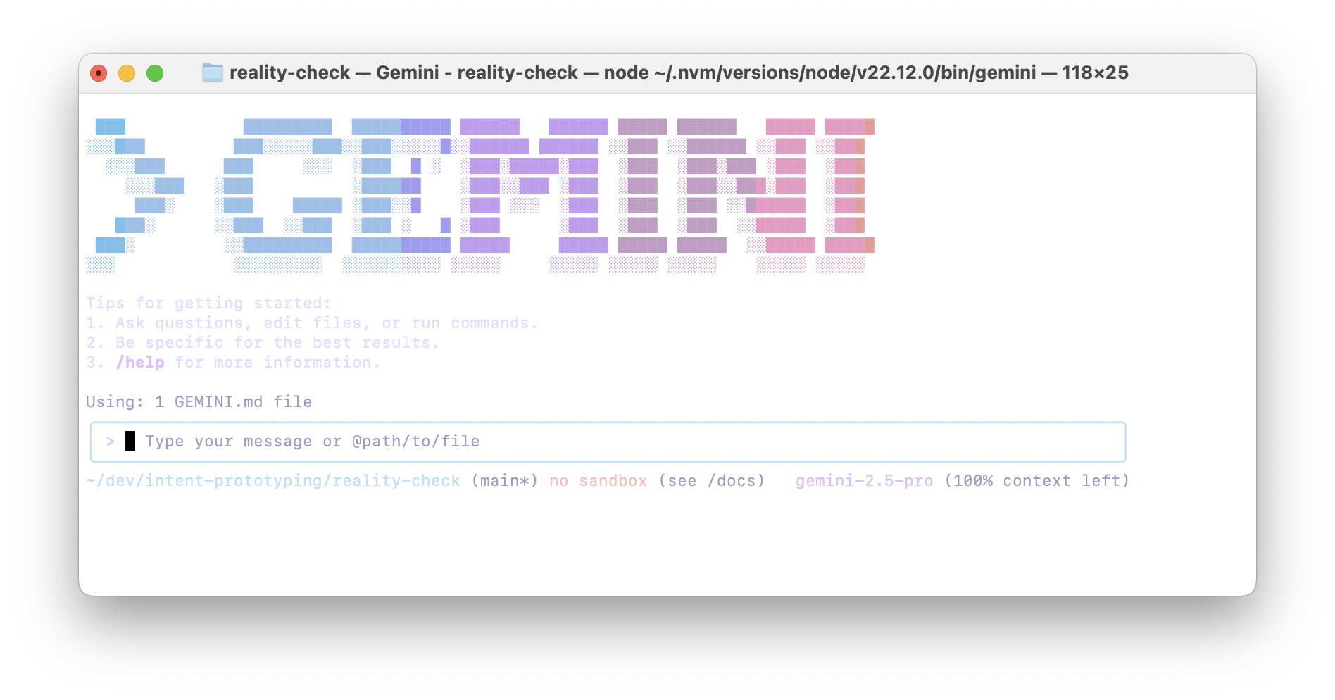
Once the basic template with all our files is ready, we open Terminal, go to the folder where our project resides, and type “gemini”:
And we send the prompt to build the Data Access Layer (see Appendix 6). That prompt implies step-by-step execution, so upon completion of each step, I send the following:
Thank you! Now, please move to the next task.
Remember that you must not make assumptions based on common patterns; always verify them with the actual data from the spec.
After each task, stop so that I can test it. Don’t move to the next task before I tell you to do so.
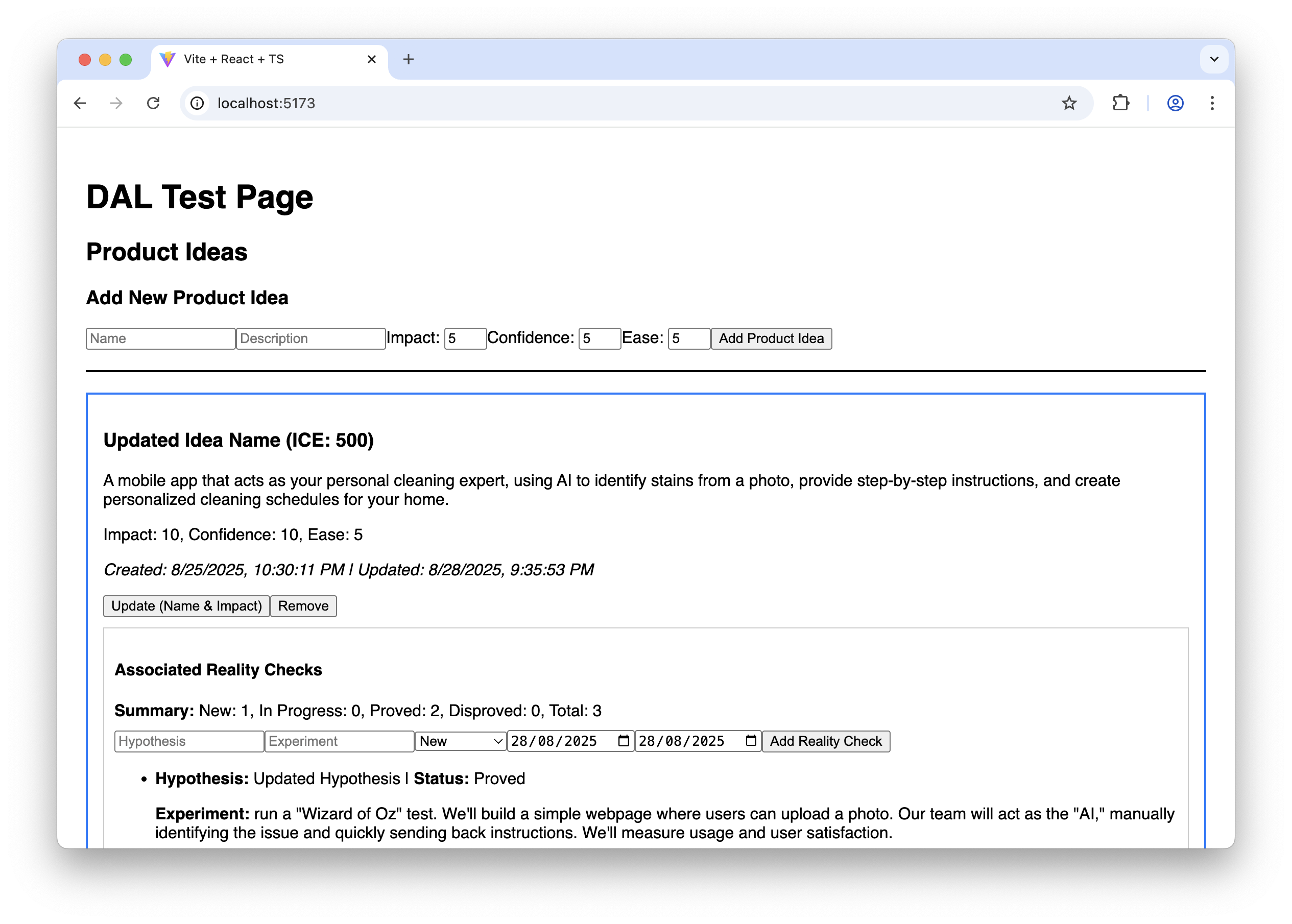
As the last task in the plan, the agent builds a special page where we can test all the capabilities of our Data Access Layer, so that we can manually test it. It may look like this:
The AI-generated test page for the Data Access Layer. (Large preview)
It doesn’t look fancy, to say the least, but it allows us to ensure that the Data Access Layer works correctly before we proceed with building the final UI.
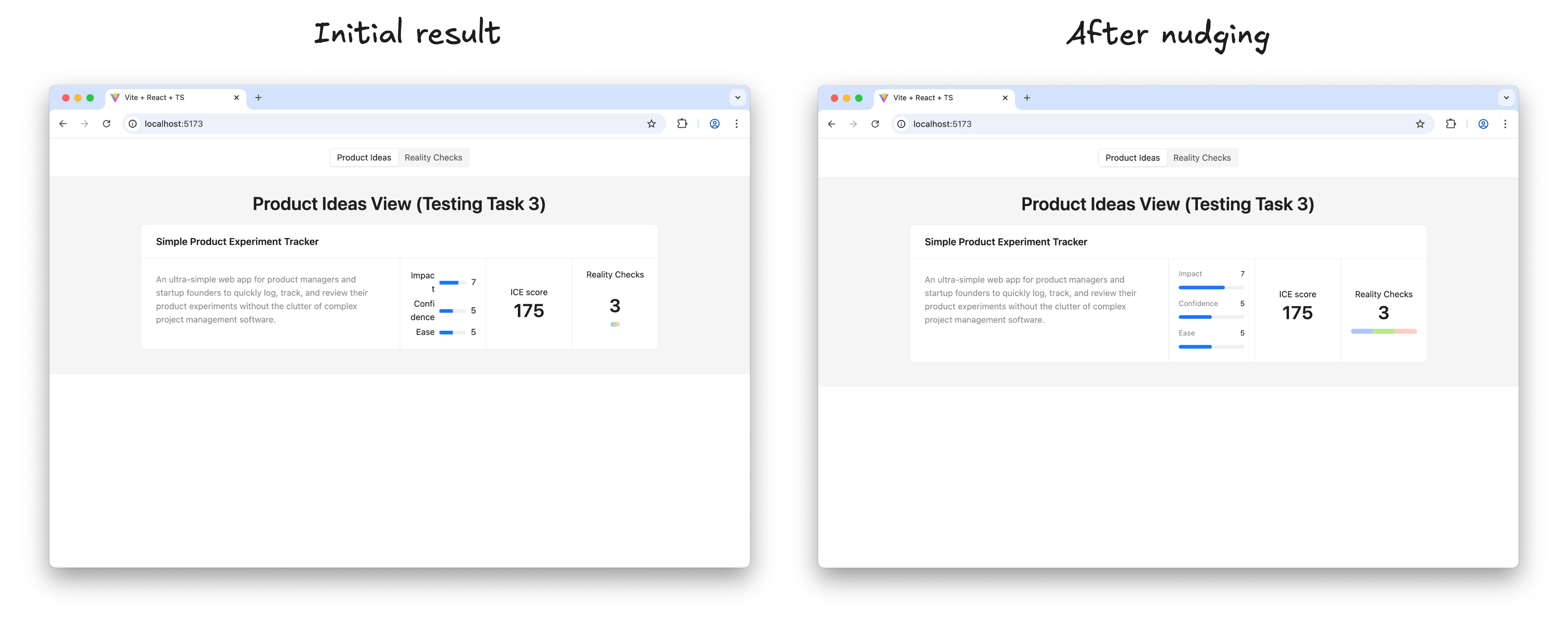
And finally, we clear the Gemini CLI context window to give it more headspace and send the prompt to build the UI (see Appendix 7). This prompt also implies step-by-step execution. Upon completion of each step, we test how it works and how it looks, following the “Manual Testing Plan” from UI-plan.md. I have to say that despite the fact that the sketch has been uploaded to the model context and, in general, Gemini tries to follow it, attention to visual detail is not one of its strengths (yet). Usually, a few additional nudges are needed at each step to improve the look and feel:
Refining the AI-generated UI to match the sketch. (Large preview)
Once I’m happy with the result of a step, I ask Gemini to move on:
Thank you! Now, please move to the next task.
Make sure you build the UI according to the sketch; this is very important. Remember that you must not make assumptions based on common patterns; always verify them with the actual data from the spec and the sketch.
After each task, stop so that I can test it. Don’t move to the next task before I tell you to do so.
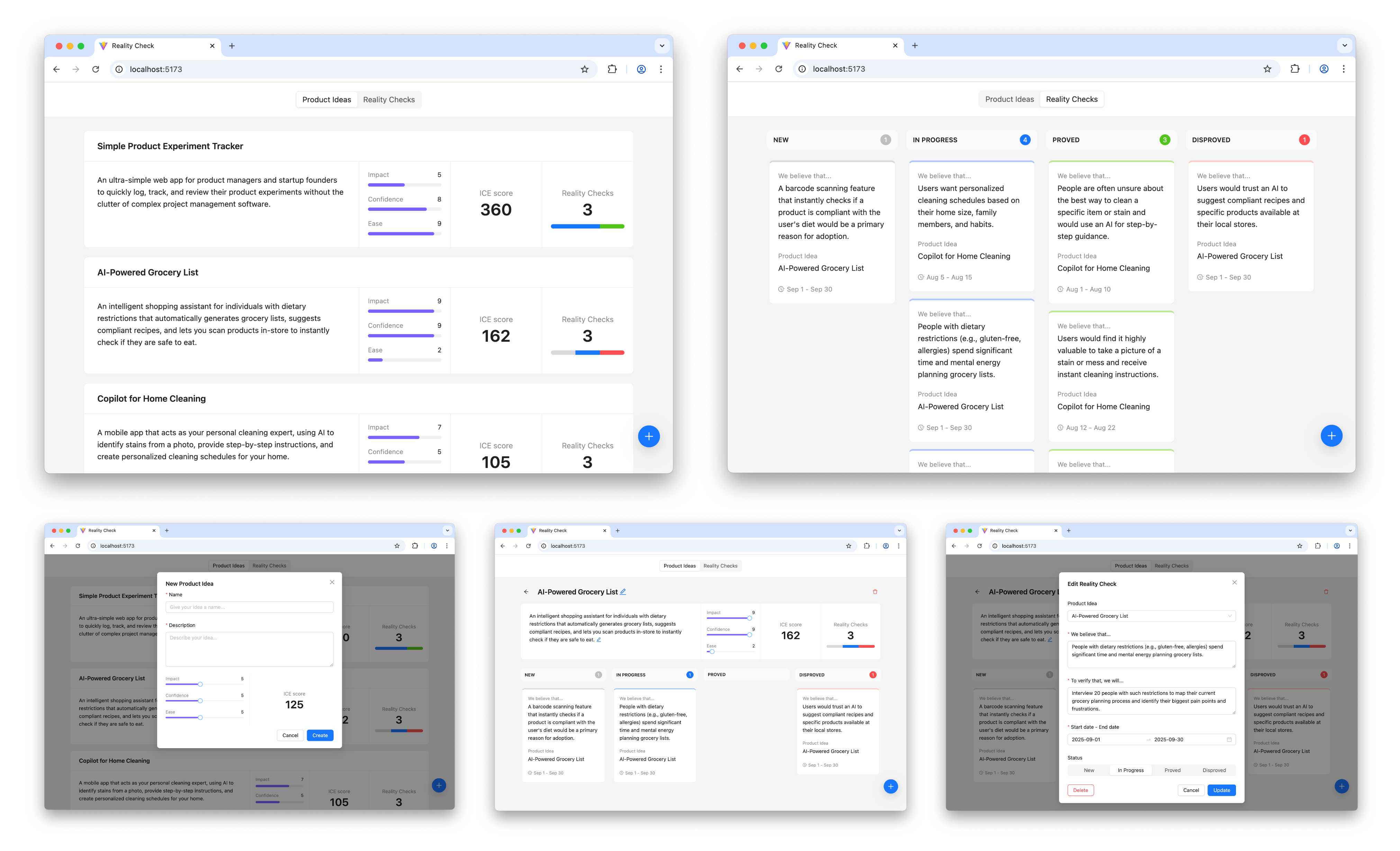
Before long, the result looks like this, and in every detail it works exactly as we intended:
The prototype is up and running and looking nice. Does it mean that we are done with our work? Surely not, the most fascinating part is just beginning.
Step 4: Learning And Iterating
It’s time to put the prototype in front of potential users and learn more about whether this solution relieves their pain or not.
And as soon as we learn something new, we iterate. We adjust or extend the sketches and the conceptual model, based on that new input, we update the specifications, create plans to make changes according to the new specifications, and execute those plans. In other words, for every iteration, we repeat the steps I’ve just walked you through.
Is This Workflow Too Heavy?
This four-step workflow may create an impression of a somewhat heavy process that requires too much thinking upfront and doesn’t really facilitate creativity. But before jumping to that conclusion, consider the following:
In practice, only the first step requires real effort, as well as learning in the last step. AI does most of the work in between; you just need to keep an eye on it.
Individual iterations don’t need to be big. You can start with a Walking Skeleton: the bare minimum implementation of the thing you have in mind, and add more substance in subsequent iterations. You are welcome to change your mind about the overall direction in between iterations.
And last but not least, maybe the idea of “think before you do” is not something you need to run away from. A clear and unambiguous statement of intent can prevent many unnecessary mistakes and save a lot of effort down the road.
Intent Prototyping Vs. Other Methods
There is no method that fits all situations, and Intent Prototyping is not an exception. Like any specialized tool, it has a specific purpose. The most effective teams are not those who master a single method, but those who understand which approach to use to mitigate the most significant risk at each stage. The table below gives you a way to make this choice clearer. It puts Intent Prototyping next to other common methods and tools and explains each one in terms of the primary goal it helps achieve and the specific risks it is best suited to mitigate.
Method/Tool
Goal
Risks it is best suited to mitigate
Examples
Why
Intent Prototyping
To rapidly iterate on the fundamental architecture of a data-heavy application with a complex conceptual model, sophisticated business logic, and non-linear user flows.
Building a system with a flawed or incoherent conceptual model, leading to critical bugs and costly refactoring.
A CRM (Customer Relationship Management system).
A Resource Management Tool.
A No-Code Integration Platform (admin’s UI).
It enforces conceptual clarity. This not only de-risks the core structure but also produces a clear, documented blueprint that serves as a superior specification for the engineering handoff.
Vibe Coding (Conversational)
To rapidly explore interactive ideas through improvisation.
Losing momentum because of analysis paralysis.
An interactive data table with live sorting/filtering.
A novel navigation concept.
A proof-of-concept for a single, complex component.
It has the smallest loop between an idea conveyed in natural language and an interactive outcome.
Axure
To test complicated conditional logic within a specific user journey, without having to worry about how the whole system works.
Designing flows that break when users don’t follow the “happy path.”
A multi-step e-commerce checkout.
A software configuration wizard.
A dynamic form with dependent fields.
It’s made to create complex if-then logic and manage variables visually. This lets you test complicated paths and edge cases in a user journey without writing any code.
Figma
To make sure that the user interface looks good, aligns with the brand, and has a clear information architecture.
Making a product that looks bad, doesn’t fit with the brand, or has a layout that is hard to understand.
A marketing landing page.
A user onboarding flow.
Presenting a new visual identity.
It excels at high-fidelity visual design and provides simple, fast tools for linking static screens.
ProtoPie, Framer
To make high-fidelity micro-interactions feel just right.
Shipping an application that feels cumbersome and unpleasant to use because of poorly executed interactions.
A custom pull-to-refresh animation.
A fluid drag-and-drop interface.
An animated chart or data visualization.
These tools let you manipulate animation timelines, physics, and device sensor inputs in great detail. Designers can carefully work on and test the small things that make an interface feel really polished and fun to use.
Low-code / No-code Tools (e.g., Bubble, Retool)
To create a working, data-driven app as quickly as possible.
The application will never be built because traditional development is too expensive.
An internal inventory tracker.
A customer support dashboard.
A simple directory website.
They put a UI builder, a database, and hosting all in one place. The goal is not merely to make a prototype of an idea, but to make and release an actual, working product. This is the last step for many internal tools or MVPs.
The key takeaway is that each method is a specialized tool for mitigating a specific type of risk. For example, Figma de-risks the visual presentation. ProtoPie de-risks the feel of an interaction. Intent Prototyping is in a unique position to tackle the most foundational risk in complex applications: building on a flawed or incoherent conceptual model.
Bringing It All Together
The era of the “lopsided horse” design, sleek on the surface but structurally unsound, is a direct result of the trade-off between fidelity and flexibility. This trade-off has led to a process filled with redundant effort and misplaced focus. Intent Prototyping, powered by modern AI, eliminates that conflict. It’s not just a shortcut to building faster — it’s a fundamental shift in how we design. By putting a clear, unambiguous intent at the heart of the process, it lets us get rid of the redundant work and focus on architecting a sound and robust system.
There are three major benefits to this renewed focus. First, by going straight to live, interactive prototypes, we shift our validation efforts from the surface to the deep, testing the system’s actual logic with users from day one. Second, the very act of documenting the design intent makes us clear about our ideas, ensuring that we fully understand the system’s underlying logic. Finally, this documented intent becomes a durable source of truth, eliminating the ambiguous handoffs and the redundant, error-prone work of having engineers reverse-engineer a designer’s vision from a black box.
Ultimately, Intent Prototyping changes the object of our work. It allows us to move beyond creating pictures of a product and empowers us to become architects of blueprints for a system. With the help of AI, we can finally make the live prototype the primary canvas for ideation, not just a high-effort afterthought.
Appendices
You can find the full Intent Prototyping Starter Kit, which includes all those prompts and guidelines, as well as the example from this article and a minimal boilerplate project, in this GitHub repository.
Appendix 1: Sketch to UML Class Diagram
+
You are an expert Senior Software Architect specializing in Domain-Driven Design. You are tasked with defining a conceptual model for an app based on information from a UI sketch.

## Workflow

Follow these steps precisely:

**Step 1:** Analyze the sketch carefully. There should be no ambiguity about what we are building.

**Step 2:** Generate the conceptual model description in the Mermaid format using a UML class diagram.

## Ground Rules

- Every entity must have the following attributes:
    - `id` (string)
    - `createdAt` (string, ISO 8601 format)
    - `updatedAt` (string, ISO 8601 format)
- Include all attributes shown in the UI: If a piece of data is visually represented as a field for an entity, include it in the model, even if it's calculated from other attributes.
- Do not add any speculative entities, attributes, or relationships ("just in case"). The model should serve the current sketch's requirements only.
- Pay special attention to cardinality definitions (e.g., if a relationship is optional on both sides, it cannot be `"1" -- "0..*"`, it must be `"0..1" -- "0..*"`).
- Use only valid syntax in the Mermaid diagram.
- Do not include enumerations in the Mermaid diagram.
- Add comments explaining the purpose of every entity, attribute, and relationship, and their expected behavior (not as a part of the diagram, in the Markdown file).

## Naming Conventions

- Names should reveal intent and purpose.
- Use PascalCase for entity names.
- Use camelCase for attributes and relationships.
- Use descriptive variable names with auxiliary verbs (e.g., isLoading, hasError).

## Final Instructions

- **No Assumptions:** Base every detail on visual evidence in the sketch, not on common design patterns.
- **Double-Check:** After composing the entire document, read through it to ensure the hierarchy is logical, the descriptions are unambiguous, and the formatting is consistent. The final document should be a self-contained, comprehensive specification.
- **Do not add redundant empty lines between items.**

Your final output should be the complete, raw markdown content for `Model.md`.
Appendix 2: Sketch to DAL Spec
+
You are an expert Senior Frontend Developer specializing in React, TypeScript, and Zustand. You are tasked with creating a comprehensive technical specification for the development team in a structured markdown document, based on a UI sketch and a conceptual model description.

## Workflow

Follow these steps precisely:

**Step 1:** Analyze the documentation carefully:

- `Model.md`: the conceptual model
- `Sketch.png`: the UI sketch

There should be no ambiguity about what we are building.

**Step 2:** Check out the guidelines:

- `TS-guidelines.md`: TypeScript Best Practices
- `React-guidelines.md`: React Best Practices
- `Zustand-guidelines.md`: Zustand Best Practices

**Step 3:** Create a Markdown specification for the stores and entity-specific hook that implements all the logic and provides all required operations.

---

## Markdown Output Structure

Use this template for the entire document.

```markdown

# Data Access Layer Specification

This document outlines the specification for the data access layer of the application, following the principles defined in `docs/guidelines/Zustand-guidelines.md`.

## 1. Type Definitions

Location: `src/types/entities.ts`

### 1.1. `BaseEntity`

A shared interface that all entities should extend.

[TypeScript interface definition]

### 1.2. `[Entity Name]`

The interface for the [Entity Name] entity.

[TypeScript interface definition]

## 2. Zustand Stores

### 2.1. Store for `[Entity Name]`

**Location:** `src/stores/[Entity Name (plural)].ts`

The Zustand store will manage the state of all [Entity Name] items.

**Store State (`[Entity Name]State`):**

[TypeScript interface definition]

**Store Implementation (`use[Entity Name]Store`):**

- The store will be created using `create()(...)`.
- It will use the `persist` middleware from `zustand/middleware` to save state to `localStorage`. The persistence key will be `[entity-storage-key]`.
- `[Entity Name (plural, camelCase)]` will be a dictionary (`Record`) for O(1) access.

**Actions:**

- **`add[Entity Name]`**:
    [Define the operation behavior based on entity requirements]
- **`update[Entity Name]`**:
    [Define the operation behavior based on entity requirements]
- **`remove[Entity Name]`**:
    [Define the operation behavior based on entity requirements]
- **`doSomethingElseWith[Entity Name]`**:
    [Define the operation behavior based on entity requirements]

## 3. Custom Hooks

### 3.1. `use[Entity Name (plural)]`

**Location:** `src/hooks/use[Entity Name (plural)].ts`

The hook will be the primary interface for UI components to interact with [Entity Name] data.

**Hook Return Value:**

[TypeScript interface definition]

**Hook Implementation:**

[List all properties and methods returned by this hook, and briefly explain the logic behind them, including data transformations, memoization. Do not write the actual code here.]

```

---

## Final Instructions

- **No Assumptions:** Base every detail in the specification on the conceptual model or visual evidence in the sketch, not on common design patterns.
- **Double-Check:** After composing the entire document, read through it to ensure the hierarchy is logical, the descriptions are unambiguous, and the formatting is consistent. The final document should be a self-contained, comprehensive specification.
- **Do not add redundant empty lines between items.**

Your final output should be the complete, raw markdown content for `DAL.md`.
Appendix 3: Sketch to UI Spec
+
You are an expert Senior Frontend Developer specializing in React, TypeScript, and the Ant Design library. You are tasked with creating a comprehensive technical specification by translating a UI sketch into a structured markdown document for the development team.

## Workflow

Follow these steps precisely:

**Step 1:** Analyze the documentation carefully:

- `Sketch.png`: the UI sketch
  - Note that red lines, red arrows, and red text within the sketch are annotations for you and should not be part of the final UI design. They provide hints and clarification. Never translate them to UI elements directly.
- `Model.md`: the conceptual model
- `DAL.md`: the Data Access Layer spec

There should be no ambiguity about what we are building.

**Step 2:** Check out the guidelines:

- `TS-guidelines.md`: TypeScript Best Practices
- `React-guidelines.md`: React Best Practices

**Step 3:** Generate the complete markdown content for a new file, `UI.md`.

---

## Markdown Output Structure

Use this template for the entire document.

```markdown

# UI Layer Specification

This document specifies the UI layer of the application, breaking it down into pages and reusable components based on the provided sketches. All components will adhere to Ant Design's principles and utilize the data access patterns defined in `docs/guidelines/Zustand-guidelines.md`.

## 1. High-Level Structure

The application is a single-page application (SPA). It will be composed of a main layout, one primary page, and several reusable components.

### 1.1. `App` Component

The root component that sets up routing and global providers.

-   **Location**: `src/App.tsx`
-   **Purpose**: To provide global context, including Ant Design's `ConfigProvider` and `App` contexts for message notifications, and to render the main page.
-   **Composition**:
  -   Wraps the application with `ConfigProvider` and `App as AntApp` from 'antd' to enable global message notifications as per `simple-ice/antd-messages.mdc`.
  -   Renders `[Page Name]`.

## 2. Pages

### 2.1. `[Page Name]`

-   **Location:** `src/pages/PageName.tsx`
-   **Purpose:** [Briefly describe the main goal and function of this page]
-   **Data Access:**
  [List the specific hooks and functions this component uses to fetch or manage its data]
-   **Internal State:**
    [Describe any state managed internally by this page using `useState`]
-   **Composition:**
    [Briefly describe the content of this page]
-   **User Interactions:**
    [Describe how the user interacts with this page]
-   **Logic:**
  [If applicable, provide additional comments on how this page should work]

## 3. Components

### 3.1. `[Component Name]`

-   **Location:** `src/components/ComponentName.tsx`
-   **Purpose:** [Explain what this component does and where it's used]
-   **Props:**
  [TypeScript interface definition for the component's props. Props should be minimal. Avoid prop drilling by using hooks for data access.]
-   **Data Access:**
    [List the specific hooks and functions this component uses to fetch or manage its data]
-   **Internal State:**
    [Describe any state managed internally by this component using `useState`]
-   **Composition:**
    [Briefly describe the content of this component]
-   **User Interactions:**
    [Describe how the user interacts with the component]
-   **Logic:**
  [If applicable, provide additional comments on how this component should work]

```

---

## Final Instructions

- **No Assumptions:** Base every detail on the visual evidence in the sketch, not on common design patterns.
- **Double-Check:** After composing the entire document, read through it to ensure the hierarchy is logical, the descriptions are unambiguous, and the formatting is consistent. The final document should be a self-contained, comprehensive specification.
- **Do not add redundant empty lines between items.**

Your final output should be the complete, raw markdown content for `UI.md`.
Appendix 4: DAL Spec to Plan
+
You are an expert Senior Frontend Developer specializing in React, TypeScript, and Zustand. You are tasked with creating a plan to build a Data Access Layer for an application based on a spec.

## Workflow

Follow these steps precisely:

**Step 1:** Analyze the documentation carefully:

- `DAL.md`: The full technical specification for the Data Access Layer of the application. Follow it carefully and to the letter.

There should be no ambiguity about what we are building.

**Step 2:** Check out the guidelines:

- `TS-guidelines.md`: TypeScript Best Practices
- `React-guidelines.md`: React Best Practices
- `Zustand-guidelines.md`: Zustand Best Practices

**Step 3:** Create a step-by-step plan to build a Data Access Layer according to the spec.

Each task should:

- Focus on one concern
- Be reasonably small
- Have a clear start + end
- Contain clearly defined Objectives and Acceptance Criteria

The last step of the plan should include creating a page to test all the capabilities of our Data Access Layer, and making it the start page of this application, so that I can manually check if it works properly.

I will hand this plan over to an engineering LLM that will be told to complete one task at a time, allowing me to review results in between.

## Final Instructions

- Note that we are not starting from scratch; the basic template has already been created using Vite.
- Do not add redundant empty lines between items.

Your final output should be the complete, raw markdown content for `DAL-plan.md`.
Appendix 5: UI Spec to Plan
+
You are an expert Senior Frontend Developer specializing in React, TypeScript, and the Ant Design library. You are tasked with creating a plan to build a UI layer for an application based on a spec and a sketch.

## Workflow

Follow these steps precisely:

**Step 1:** Analyze the documentation carefully:

- `UI.md`: The full technical specification for the UI layer of the application. Follow it carefully and to the letter.
- `Sketch.png`: Contains important information about the layout and style, complements the UI Layer Specification. The final UI must be as close to this sketch as possible.

There should be no ambiguity about what we are building.

**Step 2:** Check out the guidelines:

- `TS-guidelines.md`: TypeScript Best Practices
- `React-guidelines.md`: React Best Practices

**Step 3:** Create a step-by-step plan to build a UI layer according to the spec and the sketch.

Each task must:

- Focus on one concern.
- Be reasonably small.
- Have a clear start + end.
- Result in a verifiable increment of the application. Each increment should be manually testable to allow for functional review and approval before proceeding.
- Contain clearly defined Objectives, Acceptance Criteria, and Manual Testing Plan.

I will hand this plan over to an engineering LLM that will be told to complete one task at a time, allowing me to test in between.

## Final Instructions

- Note that we are not starting from scratch, the basic template has already been created using Vite, and the Data Access Layer has been built successfully.
- For every task, describe how components should be integrated for verification. You must use the provided hooks to connect to the live Zustand store data—do not use mock data (note that the Data Access Layer has been already built successfully).
- The Manual Testing Plan should read like a user guide. It must only contain actions a user can perform in the browser and must never reference any code files or programming tasks.
- Do not add redundant empty lines between items.

Your final output should be the complete, raw markdown content for `UI-plan.md`.
Appendix 6: DAL Plan to Code
+
You are an expert Senior Frontend Developer specializing in React, TypeScript, and Zustand. You are tasked with building a Data Access Layer for an application based on a spec.

## Workflow

Follow these steps precisely:

**Step 1:** Analyze the documentation carefully:

- @docs/specs/DAL.md: The full technical specification for the Data Access Layer of the application. Follow it carefully and to the letter.

There should be no ambiguity about what we are building.

**Step 2:** Check out the guidelines:

- @docs/guidelines/TS-guidelines.md: TypeScript Best Practices
- @docs/guidelines/React-guidelines.md: React Best Practices
- @docs/guidelines/Zustand-guidelines.md: Zustand Best Practices

**Step 3:** Read the plan:

- @docs/plans/DAL-plan.md: The step-by-step plan to build the Data Access Layer of the application.

**Step 4:** Build a Data Access Layer for this application according to the spec and following the plan.

- Complete one task from the plan at a time.
- After each task, stop, so that I can test it. Don’t move to the next task before I tell you to do so.
- Do not do anything else. At this point, we are focused on building the Data Access Layer.

## Final Instructions

- Do not make assumptions based on common patterns; always verify them with the actual data from the spec and the sketch.
- Do not start the development server, I'll do it by myself.
Appendix 7: UI Plan to Code
+
You are an expert Senior Frontend Developer specializing in React, TypeScript, and the Ant Design library. You are tasked with building a UI layer for an application based on a spec and a sketch.

## Workflow

Follow these steps precisely:

**Step 1:** Analyze the documentation carefully:

- @docs/specs/UI.md: The full technical specification for the UI layer of the application. Follow it carefully and to the letter.
- @docs/intent/Sketch.png: Contains important information about the layout and style, complements the UI Layer Specification. The final UI must be as close to this sketch as possible.
- @docs/specs/DAL.md: The full technical specification for the Data Access Layer of the application. That layer is already ready. Use this spec to understand how to work with it.

There should be no ambiguity about what we are building.

**Step 2:** Check out the guidelines:

- @docs/guidelines/TS-guidelines.md: TypeScript Best Practices
- @docs/guidelines/React-guidelines.md: React Best Practices

**Step 3:** Read the plan:

- @docs/plans/UI-plan.md: The step-by-step plan to build the UI layer of the application.

**Step 4:** Build a UI layer for this application according to the spec and the sketch, following the step-by-step plan:

- Complete one task from the plan at a time.
- Make sure you build the UI according to the sketch; this is very important.
- After each task, stop, so that I can test it. Don’t move to the next task before I tell you to do so.

## Final Instructions

- Do not make assumptions based on common patterns; always verify them with the actual data from the spec and the sketch.
- Follow Ant Design's default styles and components.
- Do not touch the data access layer: it's ready and it's perfect.
- Do not start the development server, I'll do it by myself.
Appendix 8: TS-guidelines.md
+
# Guidelines: TypeScript Best Practices

## Type System & Type Safety

- Use TypeScript for all code and enable strict mode.
- Ensure complete type safety throughout stores, hooks, and component interfaces.
- Prefer interfaces over types for object definitions; use types for unions, intersections, and mapped types.
- Entity interfaces should extend common patterns while maintaining their specific properties.
- Use TypeScript type guards in filtering operations for relationship safety.
- Avoid the 'any' type; prefer 'unknown' when necessary.
- Use generics to create reusable components and functions.
- Utilize TypeScript's features to enforce type safety.
- Use type-only imports (import type { MyType } from './types') when importing types, because verbatimModuleSyntax is enabled.
- Avoid enums; use maps instead.

## Naming Conventions

- Names should reveal intent and purpose.
- Use PascalCase for component names and types/interfaces.
- Prefix interfaces for React props with 'Props' (e.g., ButtonProps).
- Use camelCase for variables and functions.
- Use UPPER_CASE for constants.
- Use lowercase with dashes for directories, and PascalCase for files with components (e.g., components/auth-wizard/AuthForm.tsx).
- Use descriptive variable names with auxiliary verbs (e.g., isLoading, hasError).
- Favor named exports for components.

## Code Structure & Patterns

- Write concise, technical TypeScript code with accurate examples.
- Use functional and declarative programming patterns; avoid classes.
- Prefer iteration and modularization over code duplication.
- Use the "function" keyword for pure functions.
- Use curly braces for all conditionals for consistency and clarity.
- Structure files appropriately based on their purpose.
- Keep related code together and encapsulate implementation details.

## Performance & Error Handling

- Use immutable and efficient data structures and algorithms.
- Create custom error types for domain-specific errors.
- Use try-catch blocks with typed catch clauses.
- Handle Promise rejections and async errors properly.
- Log errors appropriately and handle edge cases gracefully.

## Project Organization

- Place shared types in a types directory.
- Use barrel exports (index.ts) for organizing exports.
- Structure files and directories based on their purpose.

## Other Rules

- Use comments to explain complex logic or non-obvious decisions.
- Follow the single responsibility principle: each function should do exactly one thing.
- Follow the DRY (Don't Repeat Yourself) principle.
- Do not implement placeholder functions, empty methods, or "just in case" logic. Code should serve the current specification's requirements only.
- Use 2 spaces for indentation (no tabs).
Appendix 9: React-guidelines.md
+
# Guidelines: React Best Practices

## Component Structure

- Use functional components over class components
- Keep components small and focused
- Extract reusable logic into custom hooks
- Use composition over inheritance
- Implement proper prop types with TypeScript
- Structure React files: exported component, subcomponents, helpers, static content, types
- Use declarative TSX for React components
- Ensure that UI components use custom hooks for data fetching and operations rather than receive data via props, except for simplest components

## React Patterns

- Utilize useState and useEffect hooks for state and side effects
- Use React.memo for performance optimization when needed
- Utilize React.lazy and Suspense for code-splitting
- Implement error boundaries for robust error handling
- Keep styles close to components

## React Performance

- Avoid unnecessary re-renders
- Lazy load components and images when possible
- Implement efficient state management
- Optimize rendering strategies
- Optimize network requests
- Employ memoization techniques (e.g., React.memo, useMemo, useCallback)

## React Project Structure

```
/src
- /components - UI components (every component in a separate file)
- /hooks - public-facing custom hooks (every hook in a separate file)
- /providers - React context providers (every provider in a separate file)
- /pages - page components (every page in a separate file)
- /stores - entity-specific Zustand stores (every store in a separate file)
- /styles - global styles (if needed)
- /types - shared TypeScript types and interfaces
```
Appendix 10: Zustand-guidelines.md
+
# Guidelines: Zustand Best Practices

## Core Principles

- **Implement a data layer** for this React application following this specification carefully and to the letter.
- **Complete separation of concerns**: All data operations should be accessible in UI components through simple and clean entity-specific hooks, ensuring state management logic is fully separated from UI logic.
- **Shared state architecture**: Different UI components should work with the same shared state, despite using entity-specific hooks separately.

## Technology Stack

- **State management**: Use Zustand for state management with automatic localStorage persistence via the `persist` middleware.

## Store Architecture

- **Base entity:** Implement a BaseEntity interface with common properties that all entities extend:
```typescript
export interface BaseEntity {
  id: string;
  createdAt: string; // ISO 8601 format
  updatedAt: string; // ISO 8601 format
}
```
- **Entity-specific stores**: Create separate Zustand stores for each entity type.
- **Dictionary-based storage**: Use dictionary/map structures (`Record`) rather than arrays for O(1) access by ID.
- **Handle relationships**: Implement cross-entity relationships (like cascade deletes) within the stores where appropriate.

## Hook Layer

The hook layer is the exclusive interface between UI components and the Zustand stores. It is designed to be simple, predictable, and follow a consistent pattern across all entities.

### Core Principles

1.  **One Hook Per Entity**: There will be a single, comprehensive custom hook for each entity (e.g., `useBlogPosts`, `useCategories`). This hook is the sole entry point for all data and operations related to that entity. Separate hooks for single-item access will not be created.
2.  **Return reactive data, not getter functions**: To prevent stale data, hooks must return the state itself, not a function that retrieves state. Parameterize hooks to accept filters and return the derived data directly. A component calling a getter function will not update when the underlying data changes.
3.  **Expose Dictionaries for O(1) Access**: To provide simple and direct access to data, every hook will return a dictionary (`Record`) of the relevant items.

### The Standard Hook Pattern

Every entity hook will follow this implementation pattern:

1.  **Subscribe** to the entire dictionary of entities from the corresponding Zustand store. This ensures the hook is reactive to any change in the data.
2.  **Filter** the data based on the parameters passed into the hook. This logic will be memoized with `useMemo` for efficiency. If no parameters are provided, the hook will operate on the entire dataset.
3.  **Return a Consistent Shape**: The hook will always return an object containing:
    *   A **filtered and sorted array** (e.g., `blogPosts`) for rendering lists.
    *   A **filtered dictionary** (e.g., `blogPostsDict`) for convenient `O(1)` lookup within the component.
    *   All necessary **action functions** (`add`, `update`, `remove`) and **relationship operations**.
    *   All necessary **helper functions** and **derived data objects**. Helper functions are suitable for pure, stateless logic (e.g., calculators). Derived data objects are memoized values that provide aggregated or summarized information from the state (e.g., an object containing status counts). They must be derived directly from the reactive state to ensure they update automatically when the underlying data changes.

## API Design Standards

- **Object Parameters**: Use object parameters instead of multiple direct parameters for better extensibility:
```typescript

// ✅ Preferred

add({ title, categoryIds })

// ❌ Avoid

add(title, categoryIds)

```
- **Internal Methods**: Use underscore-prefixed methods for cross-store operations to maintain clean separation.

## State Validation Standards

- **Existence checks**: All `update` and `remove` operations should validate entity existence before proceeding.
- **Relationship validation**: Verify both entities exist before establishing relationships between them.

## Error Handling Patterns

- **Operation failures**: Define behavior when operations fail (e.g., updating non-existent entities).
- **Graceful degradation**: How to handle missing related entities in helper functions.

## Other Standards

- **Secure ID generation**: Use `crypto.randomUUID()` for entity ID generation instead of custom implementations for better uniqueness guarantees and security.
- **Return type consistency**: `add` operations return generated IDs for component workflows requiring immediate entity access, while `update` and `remove` operations return `void` to maintain clean modification APIs.
 — Smashing Magazine")