
Close Menu
Trendswave MediaTrendswave Media
  • Home
  • About Us
    • Contact Us
  • Services
  • Influencer Marketing
  • Marketing
  • SEO
  • Social Media
  • Web Design
  • Shop

Subscribe to Updates

Get the latest creative news from Trendswave about Marketing, SEO & Web Design.

Please enable JavaScript in your browser to complete this form.
Loading
What's Hot

Spot High and Low Engagement at a Glance with New Sent Messages Charts

September 12, 2026

A 2026 Workflow That Still Ranks

September 12, 2026

What is zero-click marketing? How to execute and measure it

September 12, 2026
Facebook X (Twitter) Instagram
Trendswave MediaTrendswave Media
  • Home
  • About Us
    • Contact Us
  • Services
  • Influencer Marketing
  • Marketing
  • SEO
  • Social Media
  • Web Design
  • Shop
Trendswave MediaTrendswave Media
Home»Marketing»Spot High and Low Engagement at a Glance with New Sent Messages Charts
Marketing

Spot High and Low Engagement at a Glance with New Sent Messages Charts

adminBy adminSeptember 12, 2026No Comments5 Mins Read
Facebook Twitter Pinterest LinkedIn Tumblr WhatsApp VKontakte Email
Spot High and Low Engagement at a Glance with New Sent Messages Charts
Share
Facebook Twitter LinkedIn Pinterest Email


By Sean Tinney August 6, 2026

Open rates, click rates, and email comparisons appear as a chart you can view at a glance. See which emails drove action and which ones didn’t. Then send more of what works.

Patterns and outliers surface at a glance, no digging required.

See engagement trends over time

The Opens and Clicks Over Time chart plots up to 100 of your most recent broadcasts on a visual timeline. The toggle lets you switch between opens and clicks to compare performance across sends. A subject line that keeps drives opens, a send day with higher engagement than the rest. Patterns like these show up here fast.
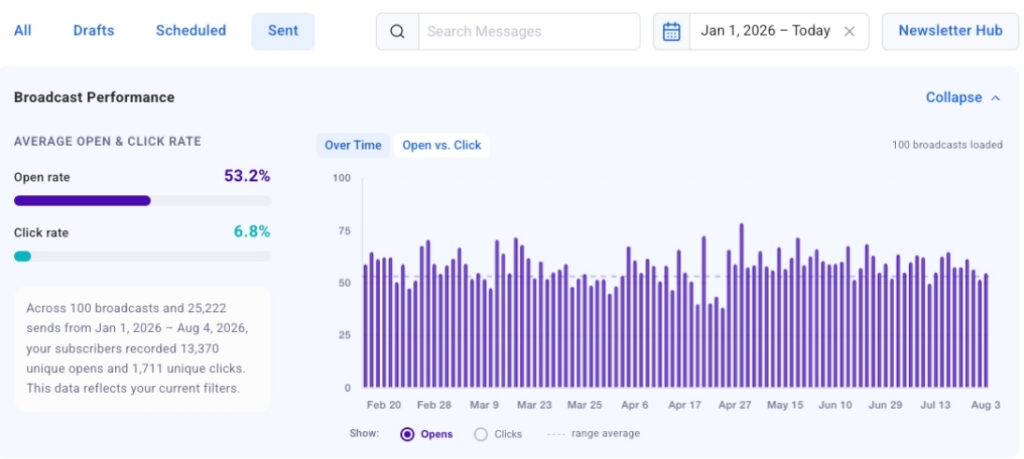
screenshot showing email engagement trends over time

Click-to-jump links any bar directly to that broadcast in the table below. From a spike in the chart to the exact message in seconds.
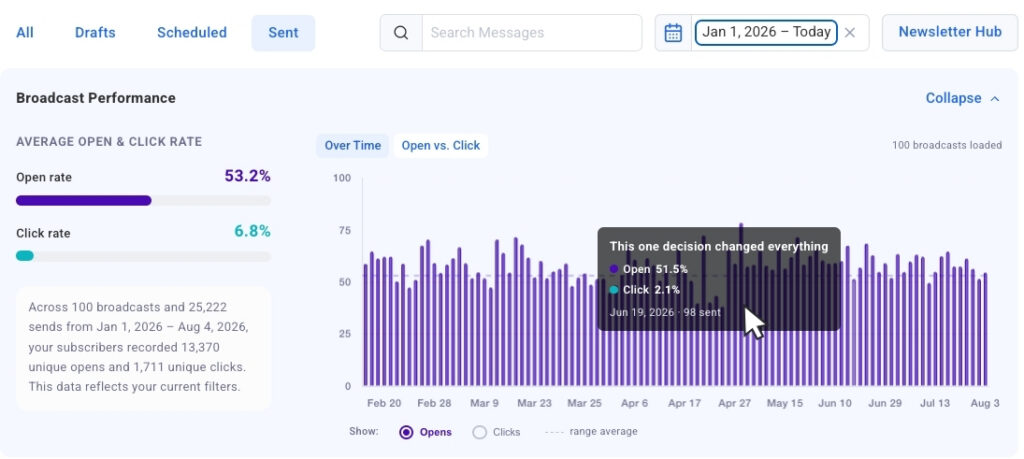
Screenshot showing click-to-jump linksScreenshot showing click-to-jump links

The chart loads automatically. As you scroll and load more broadcasts, they populate the bar chart.

See your strongest and weakest sends side by side

Switch to the Opens vs. Clicks bubble chart to see your most recent sends plotted together. Each broadcast appears as a bubble, sized by send volume, so you can compare results across different audience sizes without losing context.

Outliers surface fast here. You’ll see which broadcasts earned strong opens but fewer clicks, and which ones drove both. That tells you what to repeat and what to adjust.
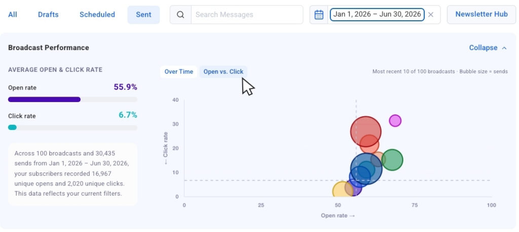
Screenshot of Opens vs. Clicks bubble chartScreenshot of Opens vs. Clicks bubble chart

Collapsible chart view keeps the chart out of the way when you want to focus purely on the numbers in the table. Expand it again whenever you want the visual context back.
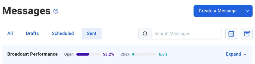
Screenshot of collapsible chart Screenshot of collapsible chart

Filter down to exactly what you want to measure

Date presets let you pull the past 30 days, 90 days, or full year with one click. The chart updates immediately to show only those sends.

Screenshot showing date filtering optionsScreenshot showing date filtering options

Dynamic search filtering goes further. Type in the search bar and the chart narrows to only broadcasts with that word in the subject line, so you’re comparing exactly the sends you care about.

Segment name filtering is coming soon too. You’ll be able to isolate chart and table data by segment, which matters since engagement naturally varies by audience.

These charts extend the broadcast analytics available in the AWeber MCP app for ChatGPT and Claude.ai, bringing that same view directly into your Dashboard. For more on tracking performance over time, see how to track and improve your email marketing performance and how to improve your email open rates.

Your Sent Messages charts are live now in AWeber.

Open rates, click rates, and email comparisons appear as a chart you can view at a glance. See which emails drove action and which ones didn’t. Then send more of what works.

Patterns and outliers surface at a glance, no digging required.

See engagement trends over time

The Opens and Clicks Over Time chart plots up to 100 of your most recent broadcasts on a visual timeline. The toggle lets you switch between opens and clicks to compare performance across sends. A subject line that keeps drives opens, a send day with higher engagement than the rest. Patterns like these show up here fast.

Click-to-jump links any bar directly to that broadcast in the table below. From a spike in the chart to the exact message in seconds.

The chart loads automatically. As you scroll and load more broadcasts, they populate the bar chart.

See your strongest and weakest sends side by side

Switch to the Opens vs. Clicks bubble chart to see your most recent sends plotted together. Each broadcast appears as a bubble, sized by send volume, so you can compare results across different audience sizes without losing context.

Outliers surface fast here. You’ll see which broadcasts earned strong opens but fewer clicks, and which ones drove both. That tells you what to repeat and what to adjust.

Collapsible chart view keeps the chart out of the way when you want to focus purely on the numbers in the table. Expand it again whenever you want the visual context back.

Filter down to exactly what you want to measure

Date presets let you pull the past 30 days, 90 days, or full year with one click. The chart updates immediately to show only those sends.

Dynamic search filtering goes further. Type in the search bar and the chart narrows to only broadcasts with that word in the subject line, so you’re comparing exactly the sends you care about.

Segment name filtering is coming soon too. You’ll be able to isolate chart and table data by segment, which matters since engagement naturally varies by audience.

These charts extend the broadcast analytics available in the AWeber MCP app for ChatGPT and Claude.ai, bringing that same view directly into your Dashboard. For more on tracking performance over time, see how to track and improve your email marketing performance and how to improve your email open rates.

Your Sent Messages charts are live now in AWeber.


Source link

Charts Engagement Glance High Messages Spot
Share. Facebook Twitter Pinterest LinkedIn Tumblr WhatsApp Email
Previous ArticleA 2026 Workflow That Still Ranks
admin
  • Website

Related Posts

DeepIntent Releases Agentic Ad Platform As Pharma Marketing Grows More Complex

September 10, 2026

How to Get AI to Recommend Your Business : Social Media Examiner

September 9, 2026

Google tests traditional Search campaigns in AI Mode

September 8, 2026

Google Showing Stale Jobs Within Job Search

September 7, 2026
Leave A Reply Cancel Reply

  • Facebook
  • Twitter
  • Pinterest
  • Instagram
  • YouTube
  • Vimeo
Don't Miss
Marketing

Spot High and Low Engagement at a Glance with New Sent Messages Charts

By adminSeptember 12, 20260

By Sean Tinney August 6, 2026 Open rates, click rates, and email comparisons appear as…

A 2026 Workflow That Still Ranks

September 12, 2026

What is zero-click marketing? How to execute and measure it

September 12, 2026

Best WordPress Hosts for Designers & Creatives in 2026 — Speckyboy

September 11, 2026

Subscribe to Updates

Get the latest creative news from Trendswave about Marketing, SEO & Web Design.

Please enable JavaScript in your browser to complete this form.
Loading
About Us

Trendswave is an Influencer Marketing Agency with access to one of the largest influencer networks in the Poland, connecting brands and agencies to only the best influencers and social media thought leaders.

Our Picks

Spot High and Low Engagement at a Glance with New Sent Messages Charts

September 12, 2026

A 2026 Workflow That Still Ranks

September 12, 2026
Quicklinks
  • Influencer Marketing
  • Marketing
  • SEO
  • Social Media
  • Web Design
  • About Us
  • Contact Us
  • Disclaimer
  • Privacy Policy
  • Terms and Conditions
© 2026 Trendswave.All Rights Reserved

Type above and press Enter to search. Press Esc to cancel.