


To be completely honest with you, I missed the news when CSS Container Queries first shipped. And when I finally heard about it, my very first thought was, “Why exactly do I need this when media queries already exist?”
I’m not proud of that reaction, knowing what I know now, but it was comforting to know that I wasn’t alone. In fact, there are legions of us out there.
What baffles me is that container queries aren’t a new feature, as it currently sits at around 94% browser support. And yet, very few people are actually using it. According to the State of CSS survey, 86% of developers are aware of container queries, but only 41.4% actually use them. Surveys can be biased and not completely representative of our entire field, but this one is certainly the best indicator we’ve got.
Kevin Powell also talked about this at SmashingConf Amsterdam 2026: Container Queries adoption has been terrible. And that is so strange to me, knowing that the ability for components to adapt to the size of their outer container has been at the top of so many CSS wishlists over the years.
I’m not particularly interested in how many people are using container queries as much as in how they are using them. I can’t account for everyone, but from what I’ve seen — including in my own early attempts — many of us are using them wrong.
The bottom line is that incorrect use comes down to the same impression I had when learning about them: they absolutely look just like media queries at first glance. And since they look similar, it’s easy to assume they serve similar purposes and work the same way.
They don’t.
Note: I should state up front that what I’m focusing on in this article is using container size queries, i.e., a responsive design technique for responding to the size of a particular container. There are also container style queries that respond to a container’s computed styles (and are experimental at the time of this writing). You can catch up on those in Juan Diego’s piece here on Smashing Magazine where he examines their possible use cases.
The viewport is a proxy. It always has been. Media queries are what gave us the illusion that screen width alone is responsible for how responsive apps adapt to their environment.
Ask yourself this: When you write @media, what are you asking the browser?
@media (min-width: 1024px) {
  .card {
    display: flex;
  }
I, like most developers, am asking the browser: How wide is the screen right now? That’s it.
Media queries answer that beautifully, but what happens when this .card component is placed in a grid cell that’s 300px wide on a 1920px desktop screen?
The media query doesn’t care; it does its job. The viewport is still 1920px, so min-width: 1024px fires and the matched query styles are applied, even though the card only has 300px of space to work with. Eventually, everything in the card deforms, overflows, or cramps up.
“Media queries are dumb. Not dumb in terms of the concept, but dumb in that they don’t know very much. In fact, most people assume that they know more than they do.”
It’s common to think of responsive design purely as a system for updating complete page layouts, like going from two columns on a large screen to a single column on a small screen.
Container Queries Look Inward
Container queries are smarter than that. They make responsive layouts more reliant on what’s happening inside a component rather than on the outer context that has no insight into a component’s contents. It is more like: “How much space is available for me in this specific spot, right now?”
Here is the same card code example we looked at in the last section, but with a container query:
.card-wrapper {
  container-name: card;
  container-type: inline-size;
}

@container card (min-width: 450px) {
  .card {
    display: flex;
    flex-direction: row;
  }
}
This changes everything. The card isn’t influenced by the viewport; its only concern is whether the .card component’s parent wrapper has at least 450px of inline (i.e., horizontal in a left-to-right writing mode) space. If that condition is true, the component goes horizontal; if not, it goes to its default block display.
See the Pen [Viewport vs Container [forked]]( by Vayo.
“Macro” Layout Vs. “Micro” Layouts
A very interesting way to distinguish @media and @container queries is the layout type.
Media queries are for the “macro” layout; they look outward. Stuff like page structure, the header that spans the window, footers, main grid layout, system preferences (prefers-color-scheme), device capabilities (touch screens). You know, anything that is majorly true to the entire page structure.
Container queries, I’d say, are for “micro” layouts, i.e., most things that live inside the “macro” layout. We use them when any content needs to responsively fit whatever space it is allocated. Components that come to mind are things like cards, widgets, forms, navigation, and so on.
In other words, think “page layout” vs. “component layout”.
An element shouldn’t magically become “tablet-sized” just because the width exceeds an abstract width threshold like 768px. Instead, it should switch layout when it has enough space to do so, whether that happens on a mobile viewport or inside a desktop sidebar.
In case you’re still not convinced, did you know there are over 2,300 unique viewport sizes on the modern web? Do you think it is possible to account for all of them?
This is how it should be.
Example: Fluid Typography Inside A Component
Responsive typography is a good example of something many of us have relied on media queries for. The fact that media queries come with their own CSS units — e.g., vw, vh, and so on — that are relative to the viewport size makes media queries look really good for adjusting font size based on the user’s screen size.
.card-title {
  font-size: clamp(100%, 1rem + 2vw, 24px);
}
This works until that same component is moved into a different context, like a sidebar, where the viewport is completely irrelevant. Now, because we tied the responsiveness to the wrong reference point, the scaled typography can get too big or too small.
Container queries come with their very own units — cqi, cqw, cqb, among others — and we can take responsive components further by coupling those units with the CSS clamp() function, using it for fluid typography that scales with the component rather than the viewport:
.card-title {
  font-size: clamp(1rem, .5rem + 3cqi, 2rem);
}
See the Pen [Fluid Typography [forked]]( by Vayo.
With this in place, the entire code is self-contained to that element’s specific container.
Example: Flexbox Wrap Detection
Interestingly, container queries can, in a way, detect the state of a component’s internal layout. It’s not bulletproof, but it is also something media queries simply cannot do because they only observe the external browser window and are structurally blind to internal layout events like when, for example, flex items wrap onto a new line. Let’s poke at that.
Flexbox is superb at wrapping content (flex-wrap: wrap), allowing flex items to automatically wrap to new lines when the flex container runs out of space to fit them in a single row. But CSS by itself can’t tell when that wrap happens. There isn’t something like a :wrapped pseudo-class or a media query like @media (flex-wrapped: true) that would get us there.
Media queries only observe the browser window, as they can’t see internal changes. That is pretty much what flex wrapping is: a width state change on the item itself.
For example, if you have a horizontal menu that is lined up with flexbox and you want the items to restyle themselves only when wrapped, you’d be in JavaScript territory, using ResizeObserver to get that information. However, when we nest container queries inside flex items, we can come up with a workaround to get what we need without JavaScript, thanks to this technique I learned from Kevin Powell. The core idea is to allow a flex item to flex-grow: 1 when we query the container’s inline size.
See the Pen [Fluid Typography [forked]]( by Vayo.
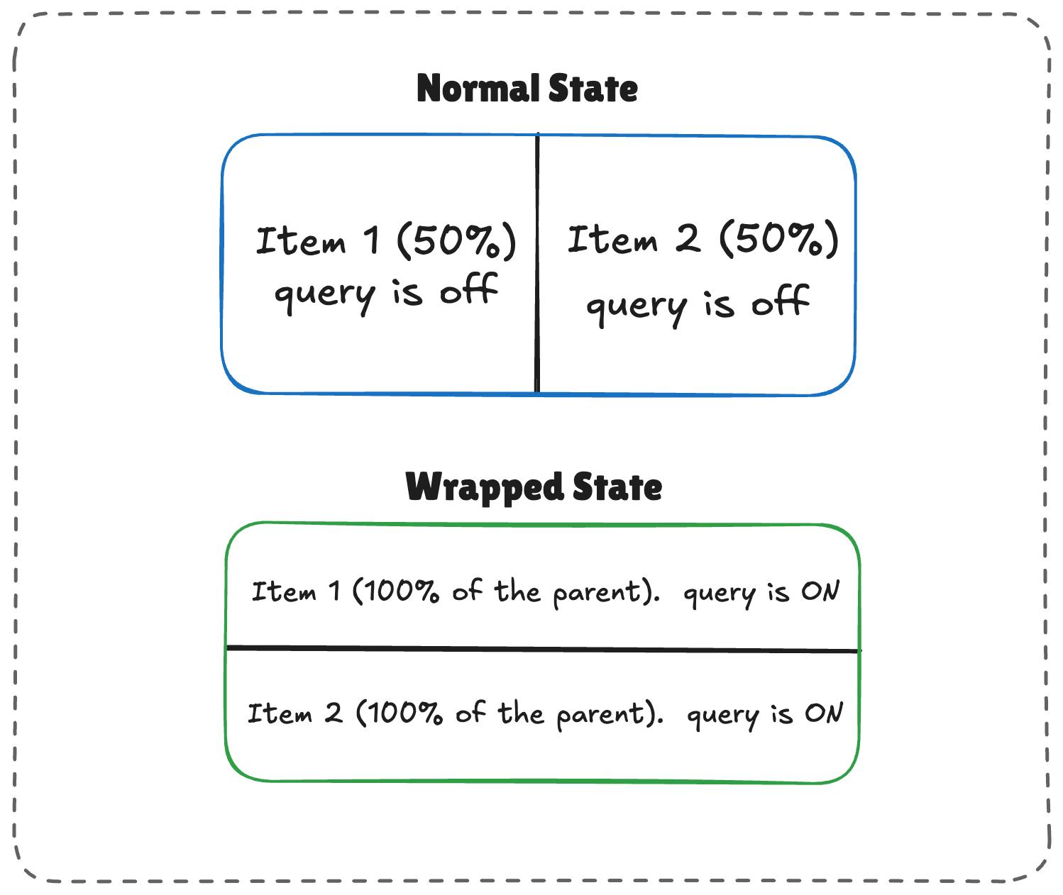
The logic works like this:
- When there’s enough room, both items (
.flex-item) sit side-by-side, each exactly half the parent container’s width. - When there is limited space, the second item wraps to the next line.
- Because
flex-growis active on each item, the wrapped items stretch to fill most of the parent’s width. - If the item is a container itself, it detects the sudden width expansion and fires.
/* The flex parent */
.flex-layout {
  display: flex;
  flex-wrap: wrap;
}

/* Register a flex item as a container */
.flex-item {
  container-type: inline-size;
  flex: 1 1 390px; /* Grow to fill space, wrap at 390px */
}

/* Default Card Styles (narrow / side-by-side) */
.card {
  display: flex;
  flex-direction: column;
  background: #f4f4f4;
}

/* Once there's enough room for a full row */
@container (min-width: 600px) {
  .card {
    flex-direction: row;
    align-items: center;
    background: #e2f0d9;
  }
}
This works. As the parent size shrinks and the cards wrap to two lines, the card item expands, the container query fires, and applies the necessary styles.
See the Pen [Flex Wrap Detection Using Container Queries [forked]]( by Vayo.
Container Queries Do Have Side Effects
Container queries, like all things, come with some side effects or caveats you will want to watch for before reaching for them.
Container queries need something similar to a parent-child relationship to function as expected. Let’s say we have this markup:
We can’t actually query the .card component to adjust the .card-content, like this:
/* DOES NOT WORK */
.card {
  container-name: card;
  container-type: inline-size;
}

@container card (min-width: 400px) {
  .card {
    display: flex;
  }
}
This doesn’t work because a container cannot query itself. In that last example, we’re querying a card container and then attempting to adjust that container’s display based on its size. It’s an infinite loop.
Instead, we need an additional wrapper that makes the .card a descendant of the container:
From there, we can query the .cards container and adjust the .card layout accordingly:
.cards {
  container-name: cards;
  container-type: inline-size;
}

@container cards (min-width: 400px) {
  .card {
    display: flex;
  }
}
In media queries, this doesn’t matter as @media does not care which element you style inside the block; its only concern is the viewport, which is always available. So you can just slap a condition on any element and call it a day.
2. Querying A Container’s size Could Collapse Your Layout
This happens when querying the container’s size (i.e., its block, or vertical, size) instead of its inline-size:
/* Collapses to 0px even if it has content inside */
.hero-banner {
  container-type: size;
}
Why? Because the browser calculates the container’s dimensions without looking at its children. If we don’t give the .hero-banner an explicit height (or min-height or aspect-ratio), the browser sets a height of 0px.
For that reason, it’s often better to query a container by its inline-size instead. That is, unless you genuinely need to query the container’s block size.
Media queries aren’t affected by this, as they treat height the same way they treat @media (min-height: ...) does, i.e., ask the viewport and move on.
3. Queries Cannot Accept Custom Properties
Another container query limitation: we can’t query against a custom property value:
:root {
  --breakpoint-lg: 1600px;
}

/* DOES NOT WORK */
@container (min-width: var(--breakpoint-lg)) {
  /* ... */
}
This is because custom properties depend on values that cascade down the DOM tree. There’s the possibility that a container query that relies on a custom property can change that same custom property. And it can quickly get complicated:
:root {
  --breakpoint-lg: 1600px;
}

/* DOES NOT WORK */
@container cards (min-width: var(--breakpoint-lg)) {
  .card {
    --breakpoint-lg: 1000px;
  }
}
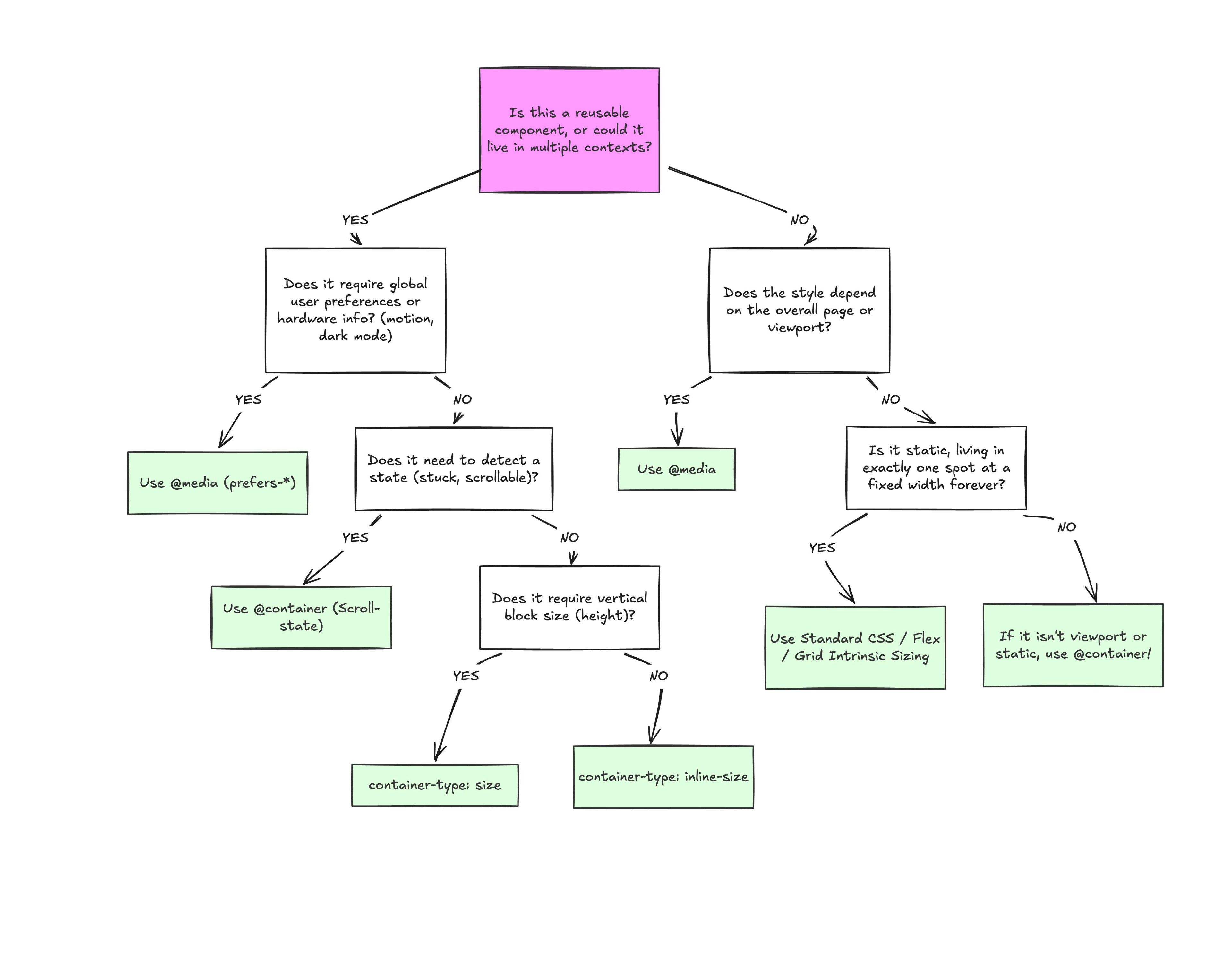
I don’t think any project should wholesale use @container instead of @media. Media queries still play an important role in responsive layouts. It’s about understanding the separation of concerns.
I tend to reach for container queries when a component is used in more than one layout context. For example, a .card element could live in a full-width grid or a narrower sidebar. If that’s the case, then we’ll want the component’s content to determine when it adjusts rather than a media query that looks at the outer viewport.
Similarly, I reach for media queries when a component solely exists at the page level. This would be something like a main navigation that always sits at the top of the page. It is directly influenced by the viewport’s size, meaning that the viewport is a reliable reference for when the navigation needs to adjust. Again, it’s all about “macro” layout versus “micro” layouts.
Here’s a diagram for how I reason about which type of query to use:
Conclusion
At the end of the day, the core reason why container queries look incredibly similar to media queries is simply familiarity. They’re not exactly “new”, but they are way less understood and adopted than media queries. But media queries have plenty of their own limitations; otherwise, we wouldn’t need container queries to fill those gaps.
What we have is a more effective feature for detecting when a specific component’s context changes and a means for adjusting styles based on its content, as it should be when that component can exist in multiple contexts.

(gg, yk)
